OK, you have
to LOVE google... pop in “Content Strategy Infographic” and dozens and dozens
of images miraculously appear. The downside is...quantity doesn’t necessarily
translate to quality. Infographics are clearly the tactic d' jour (and yes, I've capitalized on this hopefully impressing my new colleagues with my social media savvy when I recommended an infographic in a brainstorming session this week). I viewed a multitude of images – some good, some
not-so-much, some confusing, some just really trying way too hard. And in the
process I also discovered that a Content Strategy is defined in many different
ways but, in my opinion, none quite so clearly and concisely as the infographic
provided in our notes.
The beauty of
the infographic is its ability to communicate information in a manner that is memorable
and engaging, using simple visuals and icons to demonstrate the relationship between different factors – intersecting data, hubs and spokes.
Here are a few examples of The Good, The Bad, and The Ugly of infographics.

The Good. I like this
infographic – it provides a plethora of information, groups data together in
visual ‘buckets’ and demonstrates their
relationship to each other. It’s visually appealing and accessible. I get it...

The
Bad. While I was initially drawn to this visual (colourful, lots of arrows, thought bubbles, AND little green men), ultimately, I don’t think that it
delivers. What makes me think that? Well, it could be because I found that after much study and thoughtful consideration, I determined that the only way I actually understood what the heck they
were trying to communicate was when I read the list of actions? Aren't infographics supposed to REPLACE the list of words?

The Ugly. While I like the idea
of the ‘honeycomb’, this visual is far too complicated and not nearly engaging
enough. Infographics need to be accessible and you shouldn't need a magnifying
glass or an advanced degree to understand them!
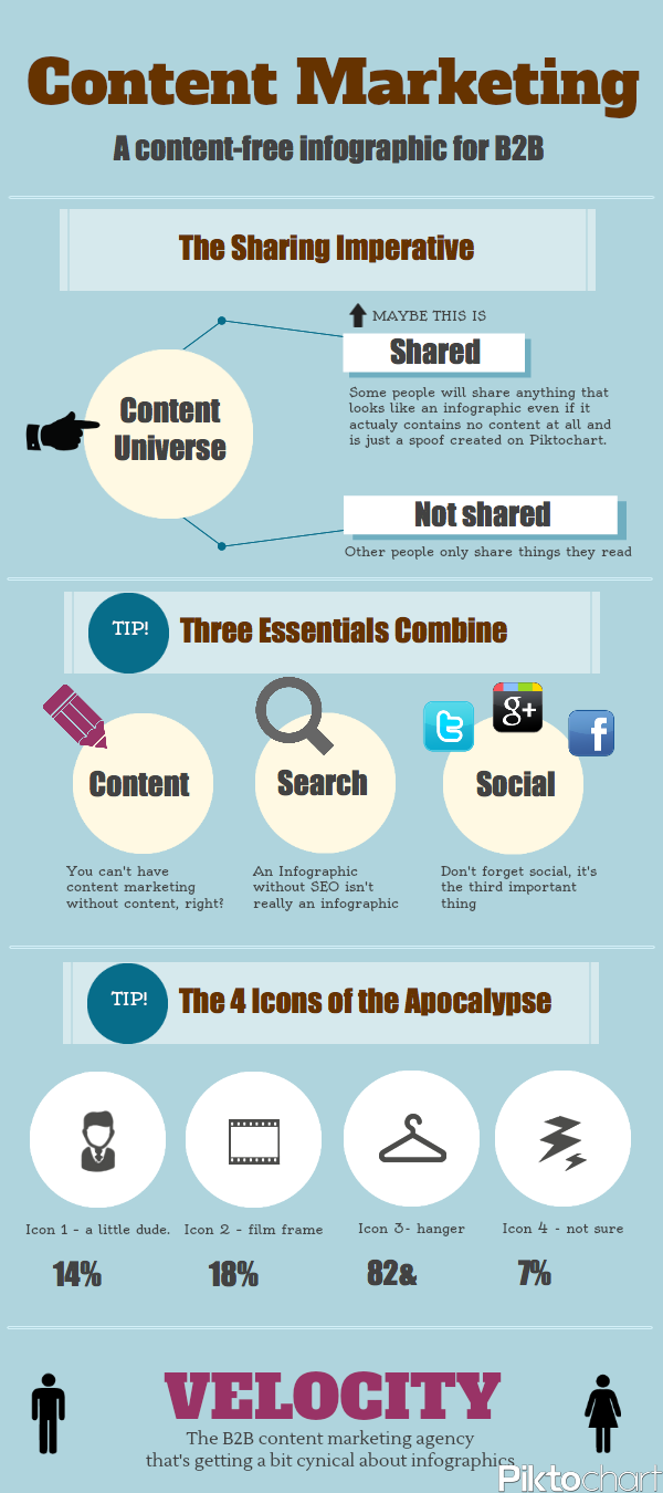
One of my favourite things about infographics is their propensity for whimsy... so here is my last example – check out the Icons of the Apocalypse. ENJOY!